about the project
This was one of my very first projects as the first and only designer at Walts TV. At the time, the Walts TV brand was very haphazard and disjointed. After some initial research at the company, I realized that there were no clear guidelines for anyone to use on any of our public or private facing webpages, apps, and communication.
It was very important to me to create a set of guidelines that will set the tone and direction of any future designs. While this was a time intensive process, it was very effective in reducing the time needed to design any future web pages, and internal applications. This project received wide praise from the company CEOs and our team of developers alike for streamlining all future projects and serving as a development reference guide.
website ui audit
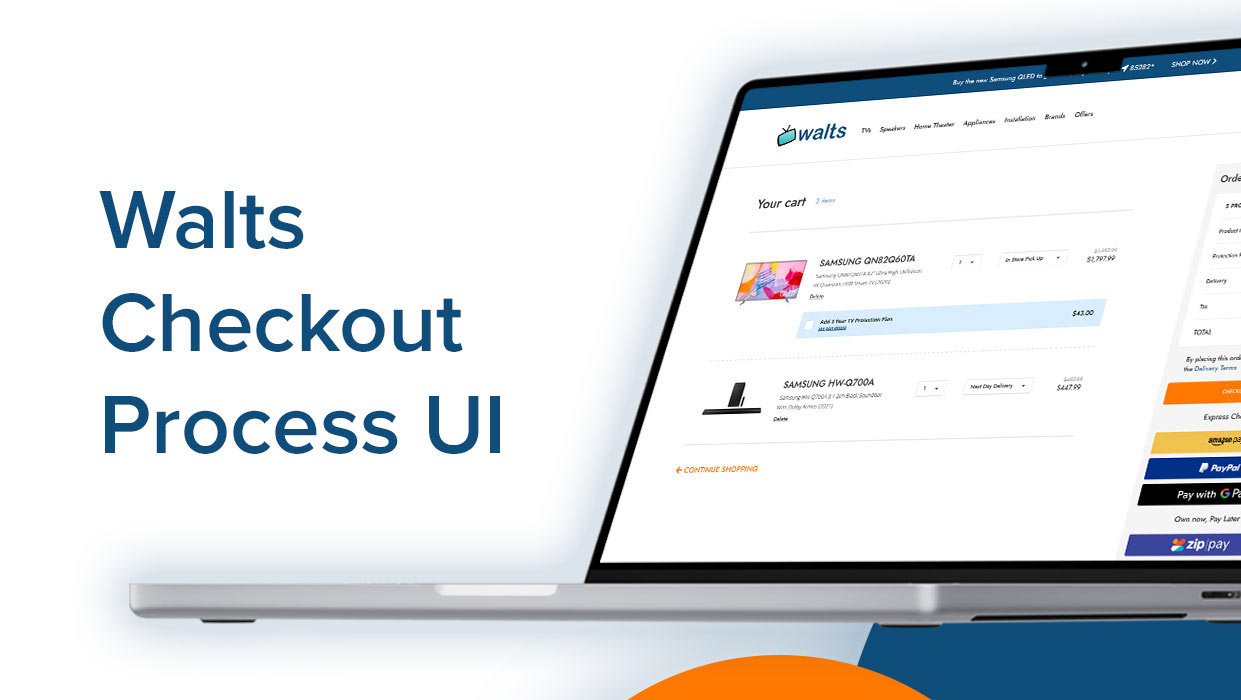
I began this project by auditing the website to take stock of the current colors, typography, buttons, and images used on the website,
The goal was to develop an idea of the existing branding in order to build upon that to get Walts TV to a coherent brand. During this process, it became apparent that there were numerous colors, button styles, and two different type faces used on the website. This highlighted the inconsistency and gave me a place to start in developing the new UI kit and design system with some brand guidelines included.
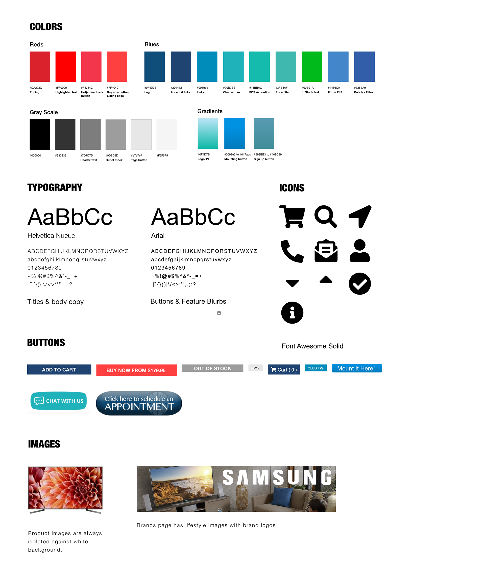
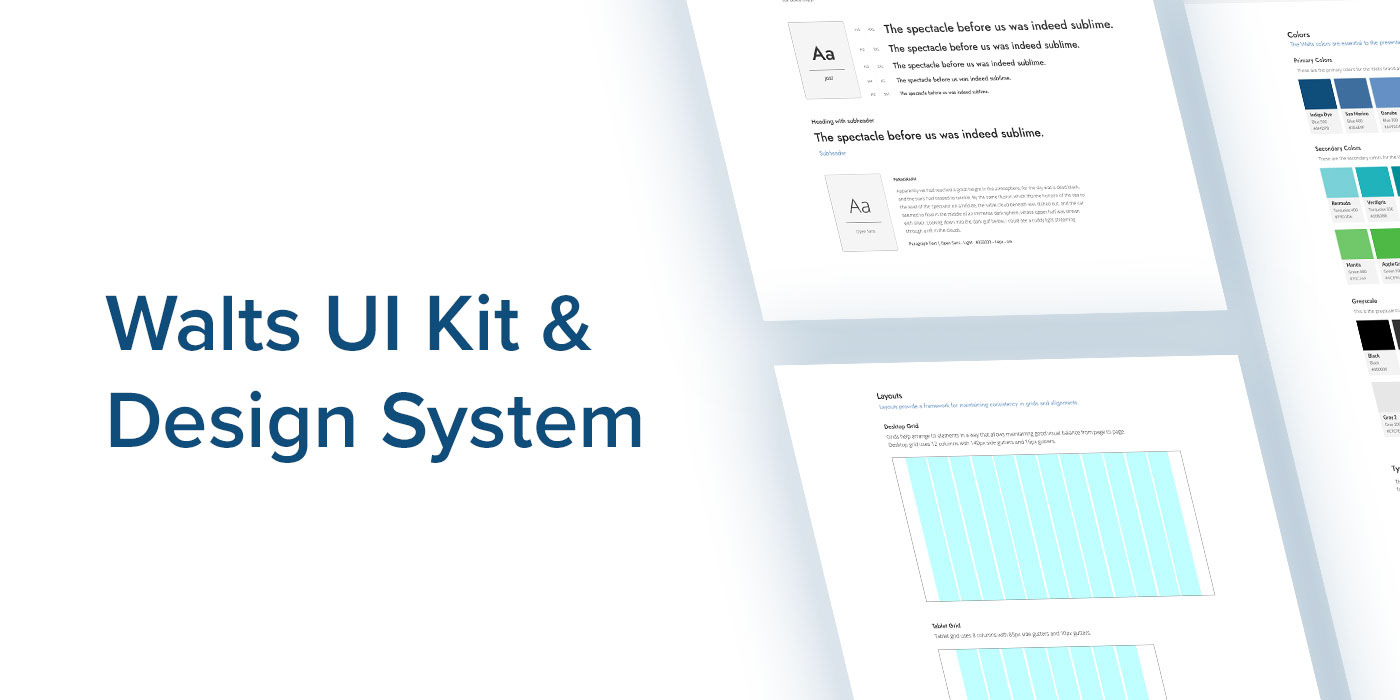
walts tv ui kit
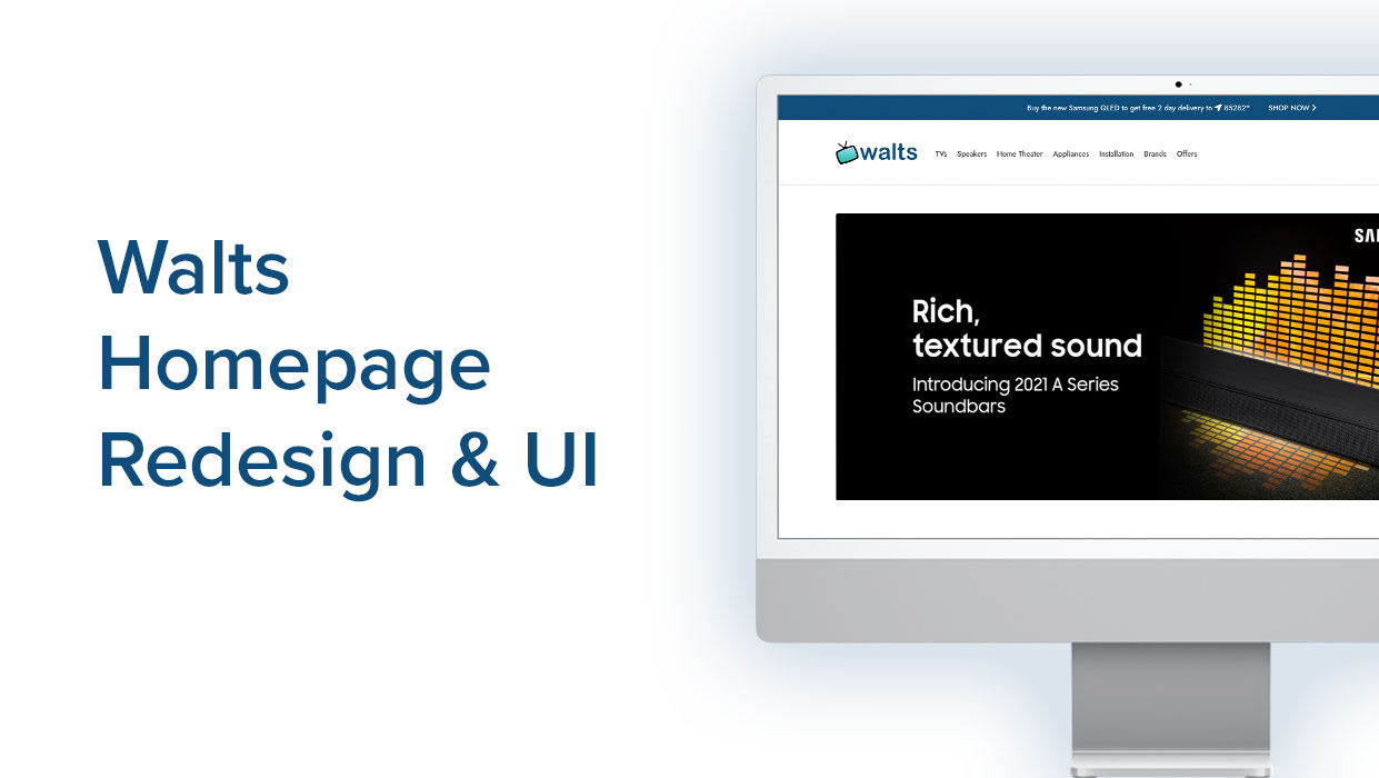
After many hours of work and referring to may online UI kits and brand guides, I decided to use the template offered by Semantic UI and build upon it to our needs. In this UI kit, I gave guidelines on everything from colors and typography, to buttons, layouts and grids, tables, iconography, and more.
To explore the full UI kit, please click through the embedded interactive kit below. Feel free to navigate the pages though the menu button on the top left of the page.
_______________________________________________________________