About Turbulence
Turbulence is a startup venture capital company that aimed to de-risk and template the startup journey.
Turbulence's strategy is to empower innovation through community as Turbulence found and funded companies in an ecosystem that fosters leadership with integrity.
I was the first (and for a long time, only) designer that was hired by Turblence during its startup phase. This allowed me to take on many different roles and gave me experience with numerous forms of design.
One of the most important long-standing tasks, was to take on the branding and, to a large extent, the creative direction of all Turbulence visuals.
Brand direction
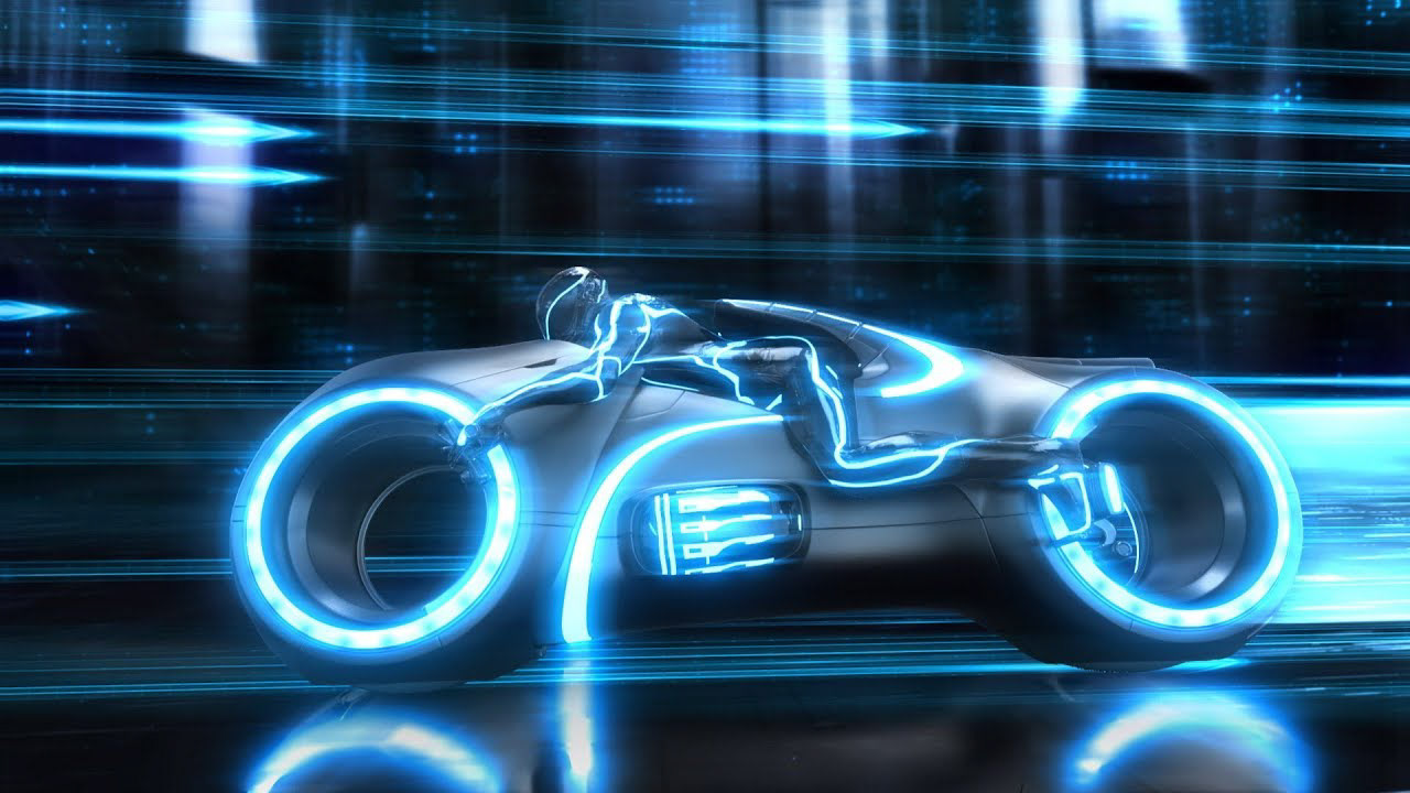
Turbulunce's aim was to revolutionize the industry with its futuristic mission. Therefore, I wanted the branding and communication to convey a futuristic feel.
The name Turbulence is meant to highlight how the company vision will disrupt the industry. Both the name, and the three dots logo were chosen by the founder. I was tasked with building a brand around this logo.

Moodboards & inspiration
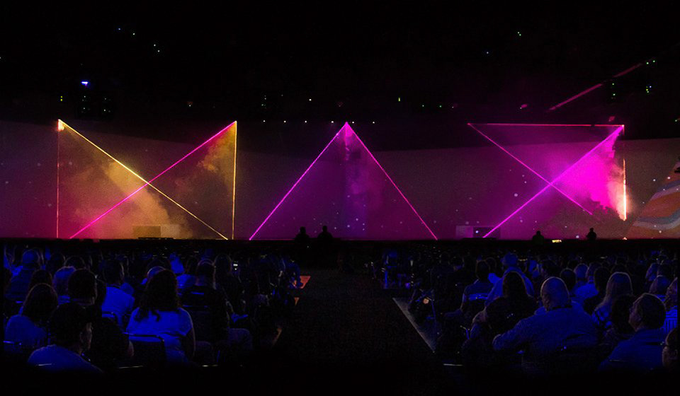
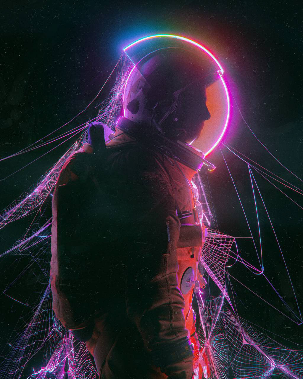
I drew inspiration from many sources and built numerous moodboards during this process. The following images are a selection from some of those moodboards that were presented to the CEO for direction approval.
We wanted the brand to be both futuristic, and minimalist in its design.
brand Fonts
With the brand direction agreed upon, I chose the Trade Gothic Condensed typeface for the Turbulence brand.
Trade Gothic is one with an interesting history. It has the classic and feel of Helvetica, but with some unique and unexpected elements. Trade Gothic's naturalist and irregular feel pair with its futuristic sharp angles and bulky heavy weights gives the the impression of a new future that is not too distant, unfamiliar or eerie.
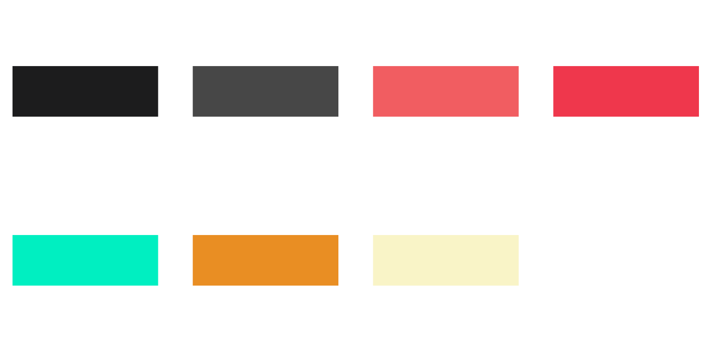
Brand Colors
From the very original vision of the Turbulence brand, we always envisioned it to be colorful and bright, with numerous colors to be used in various applications throughout the company's different branches.
The bright colors are contrasted by the muted charcoals, grays, and blacks prevalent in all brand applications.
The Electric Salmon, Turquoise, and Gold Fire is reminiscent of the most popular neon color signs. These are also the colors that generally remain when white light is scattered and while some cancel each other out these colors always remain and shine brightest.
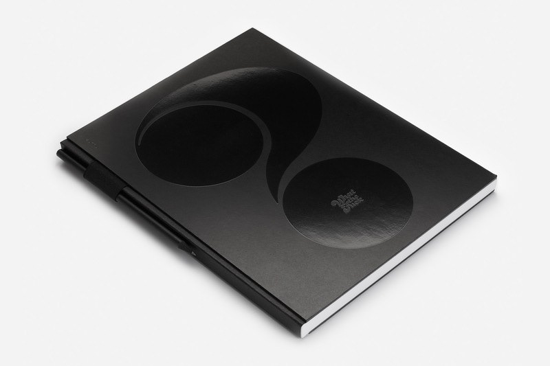
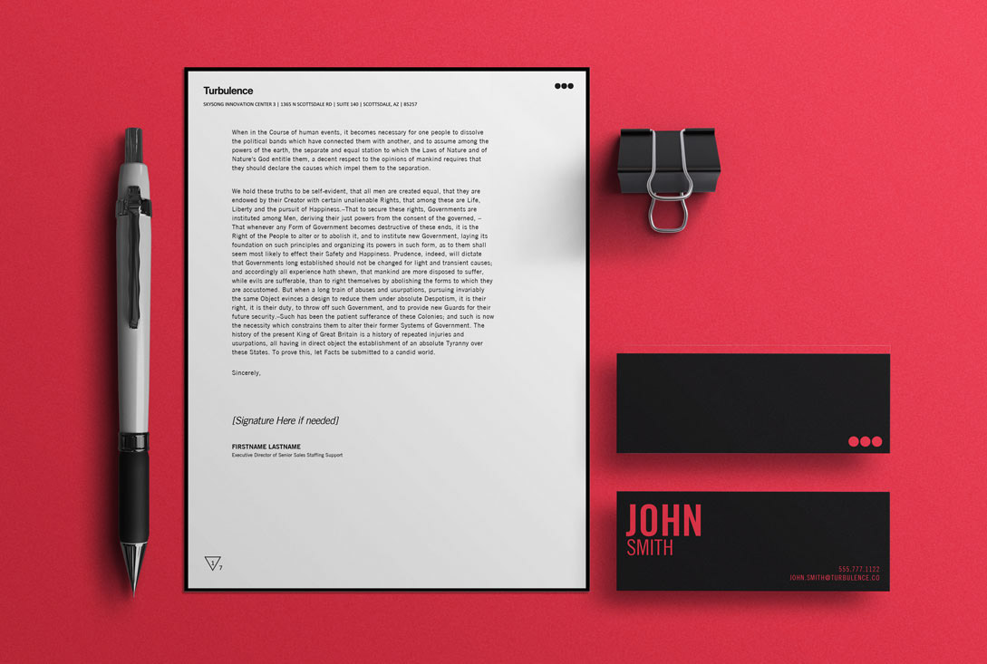
Letterhead templates
Once the typeface and colors were decided on, I moved quickly into iterating on letterhead templates and business cards.
The business cards were designed to be a smaller and more unexpected, therefore more memorable size. The different brand colors were used for the business cards depending on the department that the business card owner belonged to (think Star Trek uniform colors 😉).
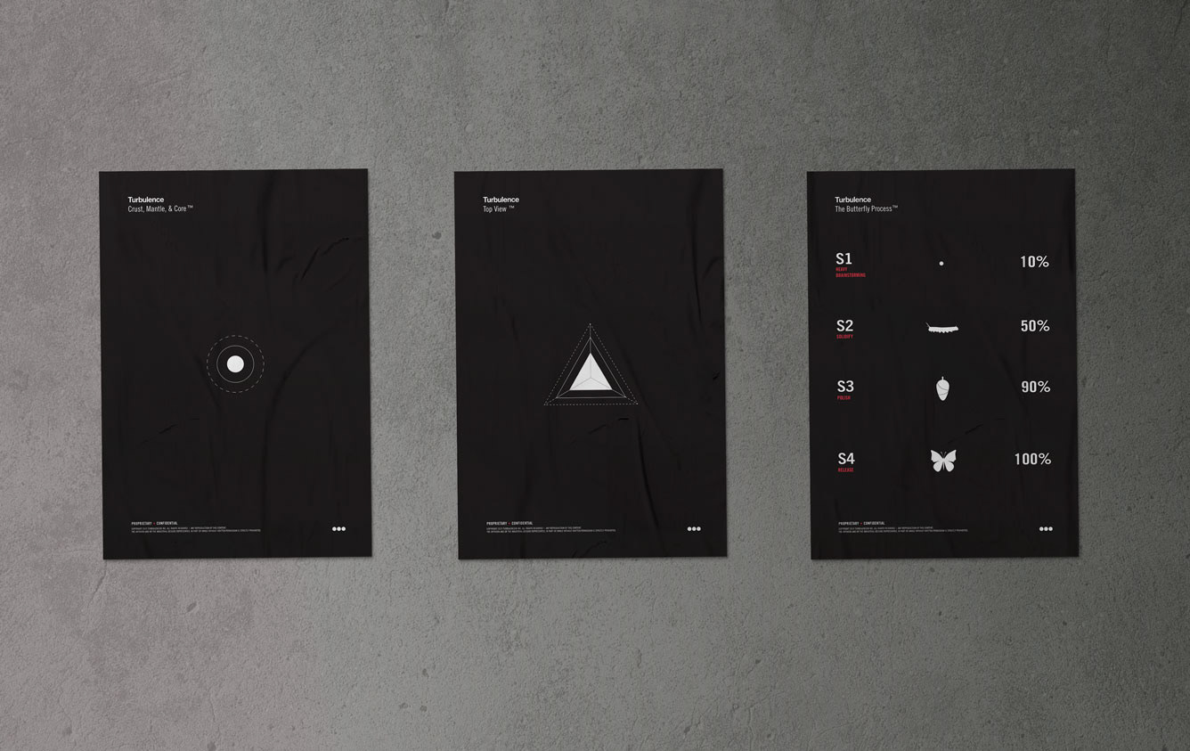
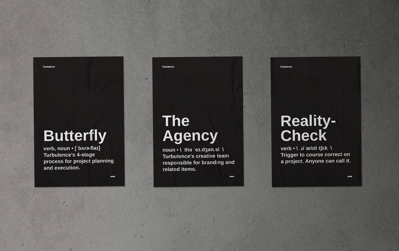
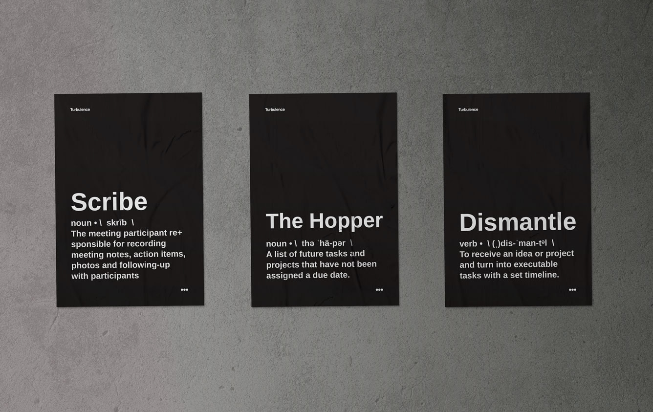
culture posters
The Turbulence employees' day-to-day interactions were filled with Turbulence specific jargon. Thus I created posters with the most commonly used ideas and phrases, to serve as an educational tool. The contents of these posters ranged from process visualizations, to organization structures, and even specialized term definitions.
I single handedly developed over 30 posters, including the layouts, most illustrations, and definitions. I hired a local printing company to produce the posters and personally hung them up around the office, as requested by the CEO.
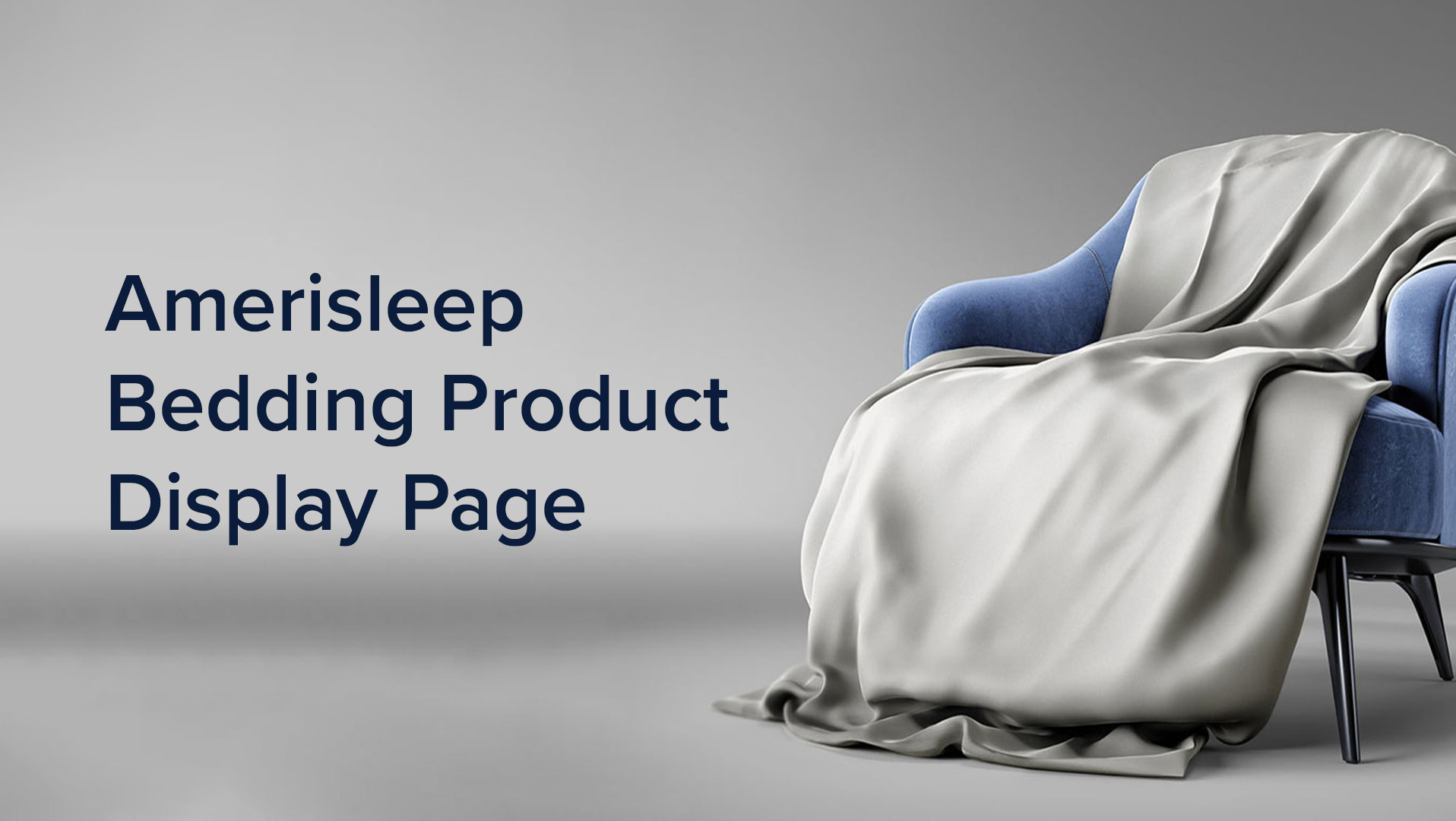
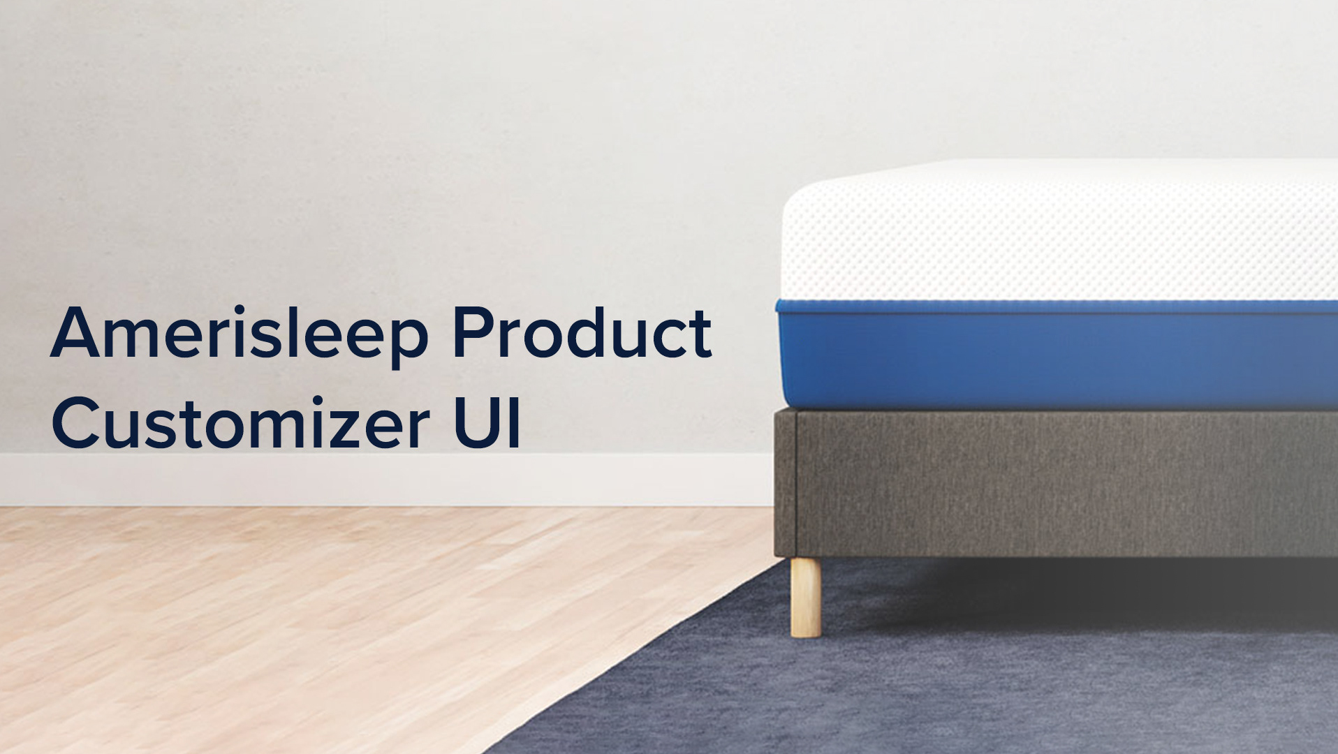
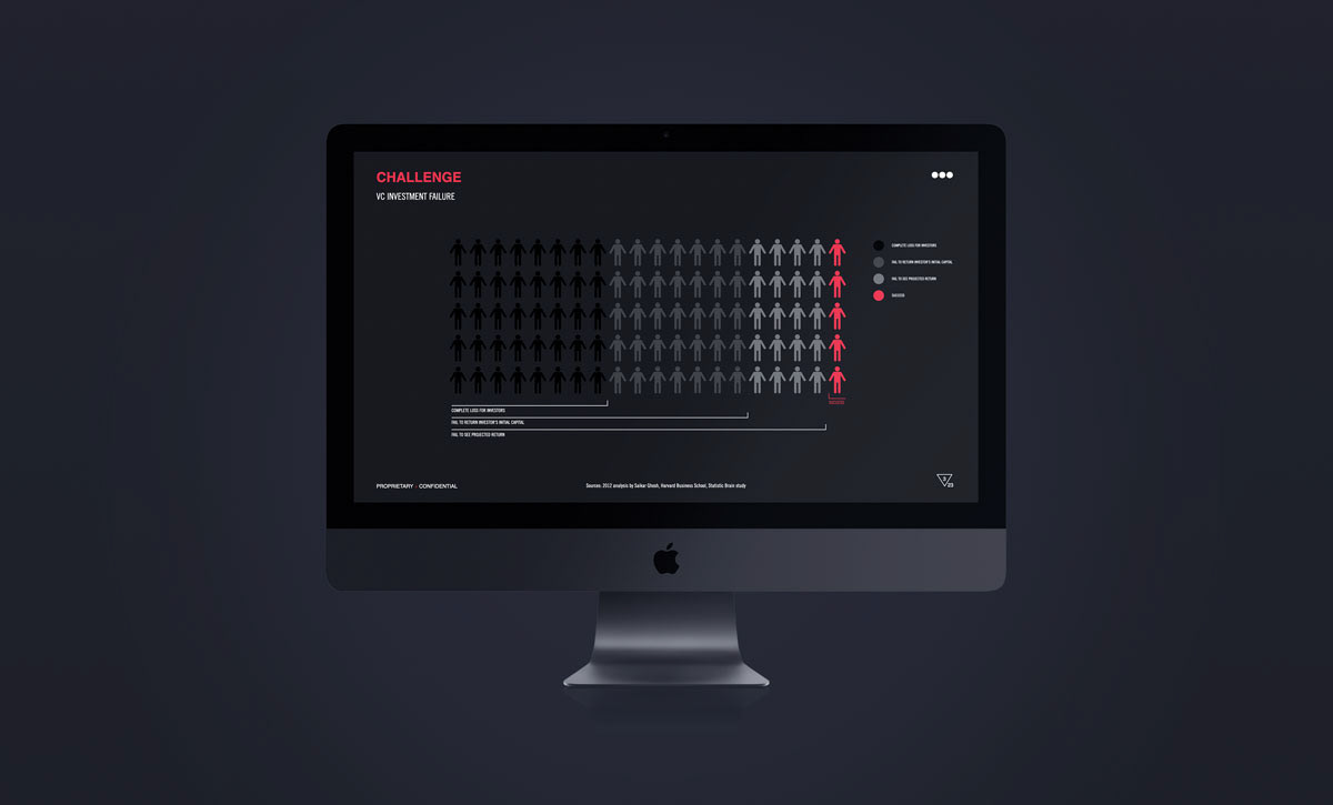
Presentation Templates & Investor Decks
The Turbulence team was always looking for buy-in from different investors and potential partners, and therefore it was very important to develop presentations that were clear, succinct, and beautiful. Thus, I designed and developed a series of investor decks, new hire onboarding decks, and presentations for our monthly all-hands meetings.
In order to ensure brand consistency throughout all communications from Turbulence, I also designed and developed presentation templates for use by the entire team. These templates included intro and exit pages, a table of contents, as well as any custom illustrations needed on a case by case scenario.
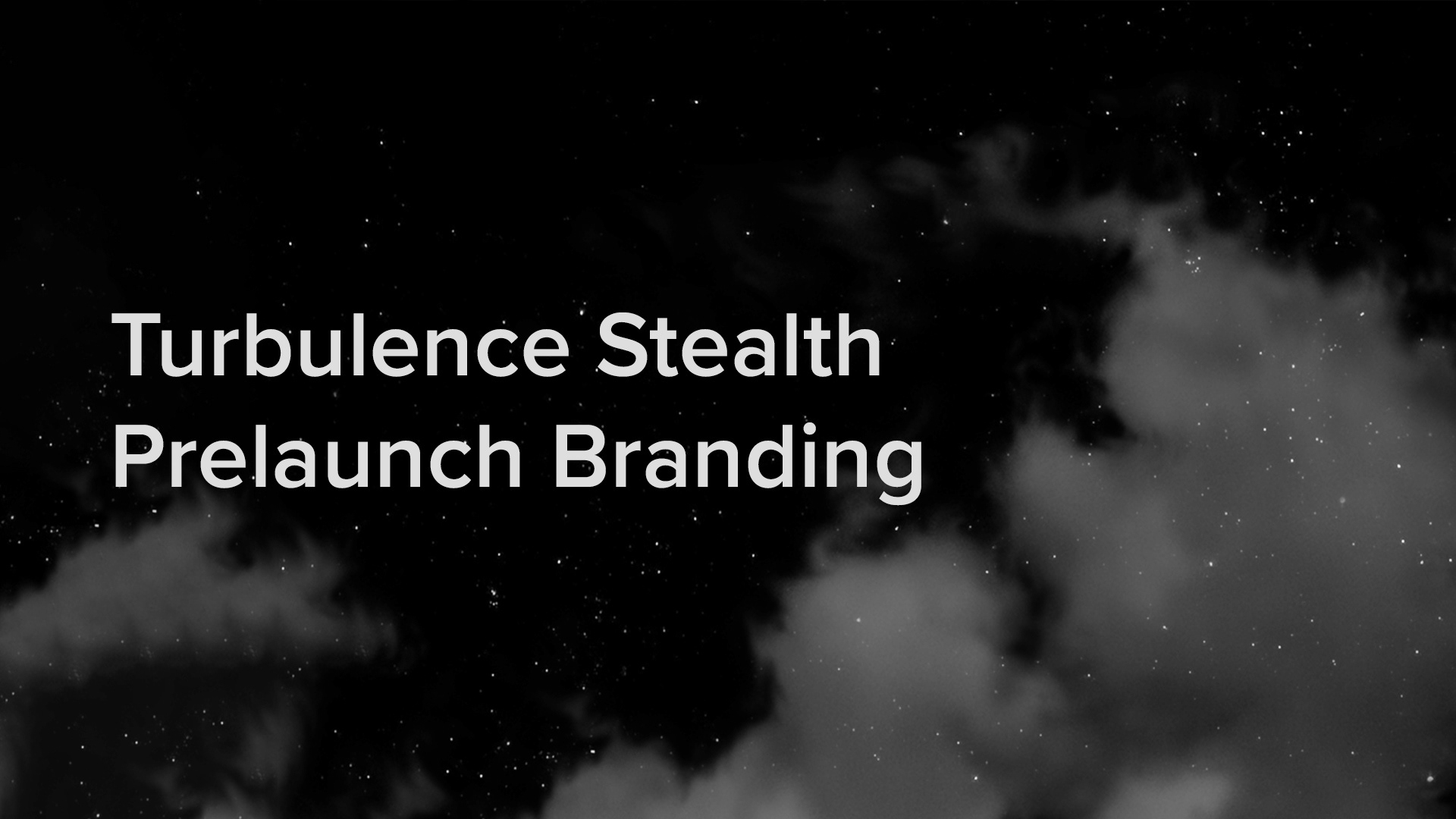
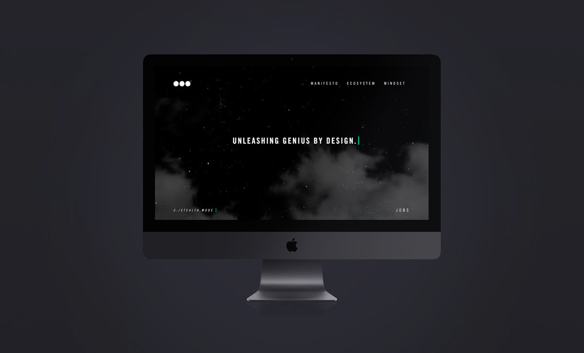
stealth website
The concept behind this design was creating a mysterious and intriguing design, that not only stood out from the others, but also compels the user to return at a future date to learn more.
After approval from the stakeholders, I was given the go ahead to create a concept inspired by sci-fi intrigue. Thus, the cloudy night sky concept was born. The night sky represents the “pre-dawn” or pre-launch state that the company was in.
A screen capture video and a link to the live site are available below.
_______________________________________________________________